Why the World Map is Wrong | Unveiled
Why the World Map is Wrong
We’ve now been mapping the world for a very long time - since at least the time of Anaximander, a Greek cartographer working in the sixth century BC! As our understanding has gradually grown, our maps have seemingly become more and more accurate. Yet even today, the charts that many of us take for granted are often less than perfect.
This is Unveiled and today we’ll be uncovering the extraordinary reasons why the world map is wrong.
Throughout history, human beings have explored more and more of planet Earth. Our knowledge of its geography has slowly improved, and the maps made to document what we know have undergone countless revisions. In Anaximander’s day, for example, he was working on the belief that only a small part of the planet was habitable - a view which we’ve long since left behind! Over the centuries that followed Anaximander, we’ve seen the shape of the world change and the number of countries within it rise and fall. As more and more people travelled greater distances across the planet, what it really looked like came into sharper and sharper focus. Today, we have satellite imagery and advanced enough computers that we needn’t even leave our desks to make map amendments, if needed. So why, then, could the world map still be described as incorrect?
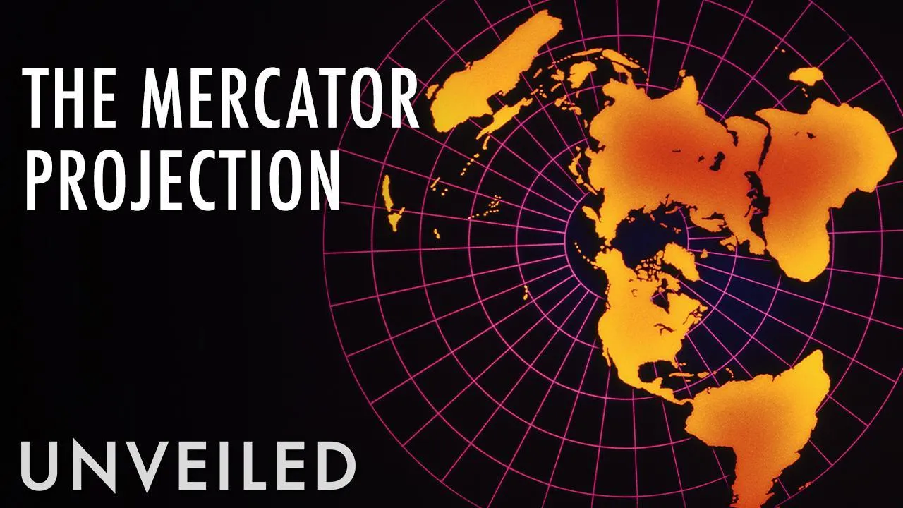
As with most things that people create, maps are generally made on a foundation of all that came before them… and the world map most people are familiar with is built on an outdated one. The most common world map seen today is based on work in 1569 by the Flemish cartographer, Gerardus Mercator, called the Mercator Projection. Anything that old is bound to carry some margin for error, but this map’s influence on the world map’s inaccuracy has more to it than simple age.
The main problem that the Mercator Projection had was that it wildly distorted the size of certain landmasses. Its scale was all wrong. On this map, and on those based on it thereafter, land close to the poles, for example, appears much larger than it is in reality. This particular distortion has imbued generations of map-readers with the impression that some parts of the world are much bigger, or smaller, than they truly are. Greenland, for instance, looks like it’s the size of Africa on the Mercator Projection map, when in reality, it would easily fit inside that same continent.
Speaking of Africa, it’s the representation of this continent - perhaps more than any other - which reveals where the Mercator Projection falls short. In real life, Africa is, well, massive – but you’d not necessarily know it by looking at a Mercator map. Most maps, even today, show Africa as big, but not especially big compared to everything else. In real terms, though, Africa could fit the United States, India, and China all inside of it, and still have room to spare! It should dominate the world map, but typically it doesn’t. And it’s not just landmasses that are misrepresented on Mercator maps – it’s also oceans! The Pacific Ocean looks fairly large, sure, but its true dimensions are staggering! At nearly sixty-four million square miles, it’s bigger than every landmass on Earth combined! If it were shown fairly on the world map, then, most of what we’d be looking at would be blue!
All of which begs the question; if the Mercator Projection is so inaccurate, how did it get so popular and widespread in the first place? Well, it was primarily designed, not to assist people in finding where things are or what they look like, but to best show how to get to them. While the lands themselves may not ring true, sailors at sea were more easily able to use Mercator maps to navigate in a straight line without having to course correct too often. Remember, in the late 16th century when Gerardus Mercator was working, Europe was at the beginning of its “Age of Exploration”- so anything to help with perilous sea crossings would prove a vital tool. Before long, his maps inevitably gained popularity on the mainland as well.
But the Mercator Projection is just one kind of map. Naturally, in response to this often-cited, yet in many ways inaccurate map, other cartographers have suggested alternatives down the years… though only a few have gained the kind of popularity that Mercator’s did. One of these others was the Gall-Peters Projection from 1855, which preserves the sizes of landmasses relative to each other, in what’s called an “equal-area map.” However, it, too, creates distortions - notably in shape - that don’t reflect reality. Another is the Lambert Conformal Conic Projection, which was first published in 1772 but is still used for aeronautical charts. Most mapping systems today use some kind of compromise between several mapping projections, however, depending on the scale required for the task at hand.
Still, in some cases we see potential political or cultural biases further altering maps. Although in ancient times this was more often explicit - with the country of the map’s maker lying at the centre of the world, for example - more recently there have been maps to make some countries look larger than they really are, arguably to promote their own importance. And it’s an ongoing point of contention why, even on widely used world maps, nations including the USA and Russia appear bigger than they are compared to others, while countries including China, Brazil and Australia are much less inflated. In many ways the inaccuracies still date back to problems with the Mercator Projection, but the genuine sizes and layout still aren’t commonly known or shown. As a knock-on effect, however, the search for more accurate maps has become a more popular pursuit of late.
Of course, one of the most glaring reasons as to why that search might never be truly satisfied is because, by definition, maps are a two-dimensional representation of a three-dimensional object. The world is a near-perfect sphere, yet maps are flat. And, while there are ways around this fact - most obviously with spherical globes - it might be argued that a truly accurate map can never be made because the medium used to make them changes the data they attempt to convey. We can’t possibly cram all that appears on the surface of a globe into a rectangular (or any other shaped) space.
Not only that, but time itself is against us in our search for the perfect world map. And that’s simply because, in a variety of ways, the world is always changing. Sea levels rise or fall, meaning that coastlines move; plate tectonics gradually shift landmasses over long periods of time; and, from a geopolitical point of view, new countries form, former countries disappear, and other countries adopt new names throughout history. So, even if the seemingly impossible were to happen and a highly skilled cartographer created a truly exact map of the world, it would very quickly find itself outdated. And that’s why the world map is wrong.
