Top 10 Hidden Messages in Famous Logos
Have you ever noticed that some of your favorite brand logos have a hidden meaning? No, it's not the work of the Illuminati: many the world's most recognizable logo designs feature sneaky concealed messages. Brands like McDonald's, Apple, Tostitos and the Tour de France are have clever logos with subliminal messages. WatchMojo takes a look at ten famous logos and their hidden meanings.
Special thanks to our users Alex Perrine, Sidharth Rao and mrpuffycheeks for suggesting this idea! Check out the voting page at http://WatchMojo.comsuggest/Top%2010%20Hidden%20Messages%20in%20Logos
#10: Tostitos
Tostitos are a must-have on movie night and a camp-out classic, but if you’re ever unsure of exactly how to eat them then just take a look at the packaging. The second and third ‘T’s are actually people like you and me, or whoever else you happen to be sharing with. While above the ‘I’, there’s a bowl of red-flavor dip – we’re guessing salsa – and the triangle of yellow is a Tostitos chip itself. The only thing this logo doesn’t tell us is how two snackers are able to split one chip? That’s a serious friendship test right there.
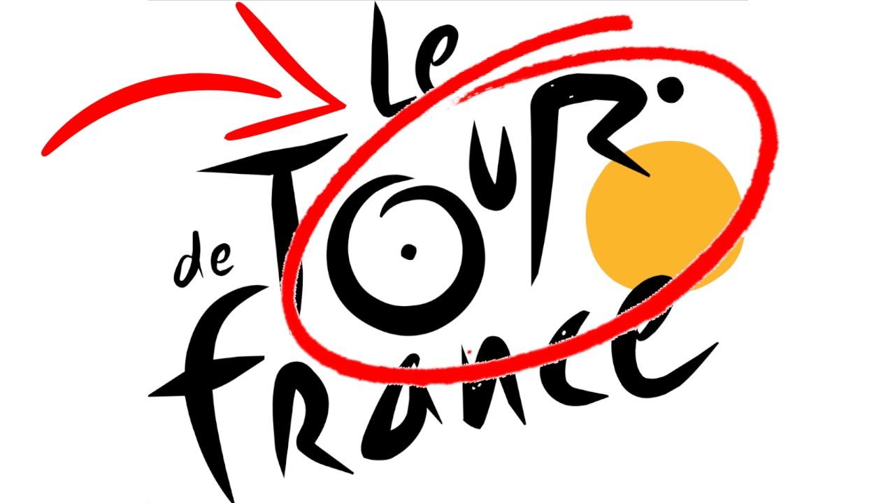
#9: Le Tour de France
In bicycle racing’s flagship event, we find one of the cleverest rebrands in recent history. French designer Joel Guenoun created the Tour de France logo for the 2003 race, which was also the 100th anniversary of the tour. A breakaway from the event’s once corporate-looking crest, it features a dynamic font and a dash of yellow in line with the famous jersey given to the race leader after each stage of the event. But look closely at the yellow circle and the ‘R’ that overlaps it, and see a cyclist hunched over his front wheel. It’s subtle, but it’s brilliant.
#8: Wendy’s
From the sublime to the subliminal… Fast food chain Wendy’s rethought its logo in 2012, freshening up its freckle-faced mascot and opting for a casual font. Wendy’s signature smile remains, as does her ruffled collar, but the button has been moved ever so slightly upwards. No big deal you might say, but the new shape appears to spell out the letters ‘M’ ‘O’ ‘M’… As in ‘mom’… As in ‘our food is as good as mom’s home cooking!’ Company execs say the hidden link is unintentional, but logo buffs are positive that it was done on purpose. Either way, it gives a whole new meaning to ‘parental guidance.’
#7: McDonald’s
The famous golden arches haven’t always been the symbol of choice for McDonald’s. When the fast food giant started up in the 1940s, the brand mascot was Speedee – a quick-to-serve chef with a smile. The arches were an architectural design initially, used for the first franchise stores in the ‘50s. The ‘M’ or “Golden Arches” logo came next, and is now one of the most recognizable insignias on the planet. But some believe the ‘M’ is more than just a starting letter. According to psychologist Louis Cheskin, the shape works wonders on the subconscious and reminds customers of a pair of nourishing breasts –those of ‘mother McDonald’ in particular! What do you suppose Ronald would make of that??
#6: Bronx Zoo
Sometimes it’s in the white space of a logo where the really clever stuff happens. At first glance, the sign for the Bronx Zoo is a silhouette of two giraffes and three birds in flight. But, look closer at the negative space and you see a city skyline made up of NYC-inspired skyscrapers. Not only is this logo a clever use of shape, but it also perfectly sums up what the Bronx Zoo is all about; magnificent animals in the middle of a metropolis. The zoo changed its branding in 2015 in line with the Wildlife Conservation Society, a conservation organization that manages it, but the giraffes of the past are still genius.
#5: Apple Inc.
The story behind the Apple logo is an ever-changing one. Some theories say that it represents knowledge – based on the Biblical connection to Adam, Eve, and the Garden of Eden, as well as an apple being Isaac Newton’s inspiration. Logo designer Rob Janoff has previously insisted that the image was only made with aesthetics in mind. Other whispers from the tech giant suggest the symbol is a nod to computer science pioneer, Alan Turing, who died eating an apple laced with cyanide, therefore inspiring the bite out of Apple’s logo. However, Janoff says the bite is only to give a sense of scale. When asked if the link to Turing was true, Steve Jobs famously replied, “God, we wish it were.”
#4: Baskin-Robbins
Company initials; pink and blue lettering; there’s nothing else to it, right? Wrong! The logo for the world’s biggest chain of ice cream specialty shops, Baskin-Robbins, also incorporates the brand’s signature claim to 31 flavors, one for every day of the month. If you read only the pink part, then the magic number magically appears – it’s an uncomplicated message, which really is hidden in plain sight. Of course, since company founders Burt and Irv set out their stall in 1945, hundreds of unique flavor combinations have been created. But, at Baskin Robbins’ ice creamy core, the original number still holds up.
#3: Toblerone
Born out of Bern in Switzerland, Toblerone remembers its roots with its logo, which features the city’s Matterhorn mountain. But Bern is also the City of Bears, which is why you can find the animal hidden in the white space on the mountainside. It takes a little while to adjust your eyes, but there’s definitely a bear there, rearing up on its hind legs. We’re just glad that the real life bears aren’t almost as big as real life mountains – what a world that would be! Nevertheless, this logo could justifiably double up as a local coat of arms!
#2: FedEx
Our runner-up is another awesome use of negative space, made all the better because the FedEx logo seems so straightforward. As a global shipping company, FedEx is a courier service carrying items from A to B. If you were to sum the company up using just one symbol, that symbol would be an arrow. And if you ignore the letters and just look at the white space, that’s exactly what you see; between the ‘E’ and the ‘X.’ It’s so subtle it looks as though it could’ve been an accident, but designers worldwide laud the FedEx logo. Lindon Leader is to thank for the world famous wordmark, which has been a graphic designer’s ‘go to’ ever since its creation in 1994.
Before we unveil our top pick, here are a few honorable mentions.
- Goodwill Industries
The ‘G’ doubles up as a smiling face
- Vaio
‘Vaio’ is a combination of symbols for ‘analog’ and ‘digital’
- BMW
The blue and white colors symbolize Bavarian Free State
#1: Amazon.com
As ‘Earth’s most customer-centric company,’ the Amazon logo is instantly recognizable. This makes it even more impressive that it actually offers three layers of hidden meaning. First, and most obvious of all, there’s a curved arrow to symbolize the shipping of goods. Second, that same arrow doubles up as a smile – telling us that this brand of online shopping is an enjoyable experience. Finally – and here’s where things get real clever – the arrow stretches from the ‘a’ to the ‘z’ of the brand name – showing us that there’s nothing which can’t be bought on Amazon. From an abacus to a zip-line, an anvil to a zipper; it’s all here, and it’s all covered by one clever logo.
Do you agree with our list? Which logo with a hidden message do you find fascinating? For more well-hidden top 10s published daily, be sure to subscribe to WatchMojo.com.
