Dressed for Success!Â
With Batwoman making her live-action debut on the CW, not only did we get another badass superhero to add to the ever expanding line-up, but also another reminder that we should be thankful for character re-designs. Who knows how things would have gone down if some of the genre’s most iconic figures were still stuck in their initial get-ups!

#5: Batwoman Leaves the 1950s Behind Â
Originally, Kathy Kane AKA Batwoman was created to prove to certain critics that Batman and Robin were strictly crime-fighting partners. Her costume reflected 1950s views of women, with an out-of-place purse that didn’t add much in terms of crime fighting ability. The new Batwoman, Kate Kane, is a rejection of the attitudes that made the previous version so outdated, and her look makes that clear at a glance. An ebony bodysuit is slashed with scarlet boots, mask, cape and gloves. The vibrancy of the blood red perfectly accents the blackness of the suit, giving her a distinct look within the Bat Family. Â

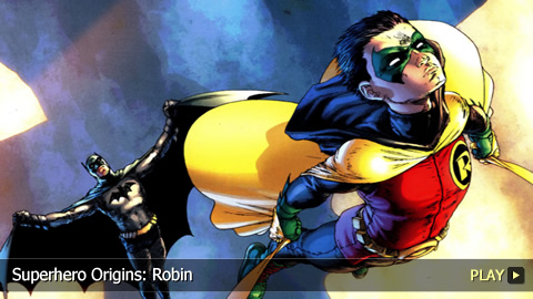
#4: The Boy Wonder Gets Long Pants (Finally)Â
Poor Robin. For decades, while practically every other superhero ran around with their legs covered, he had to patrol Gotham – a city on the east coast – in short shorts, at night! And that garish yellow capelet didn’t help matters, either. Tim Drake must’ve put it in his contract that he would get a more appropriate outfit when he became Robin – and he did. At long last, tights cover the boy wonder’s legs, and they’re paired with some awesome black boots. The capelet became a real cape, and even though it’s yellow on the inside, the outside is black – making it much easier for him to sneak up on villains and get the drop on them. Â

#3: Daredevil Delves Into Red Â
Considering this man has no sight, it’s surprising that Daredevil gave much thought to his visual presentation. But somewhere early in the game, he must have realized that his original costume – a red leotard with matching gloves and boots, over a bright yellow bodysuit – didn’t scream out “devil.†But changing the color scheme entirely to red made all the difference. A few other small touches – shrinking the devil horns slightly, revising the double-D logo and making it all tighter – completed the picture. Â

#2: Iron Man Loses the Clunky Â
Considering how obsessed Tony Stark is with perfection, it’s hard to imagine he ever went out of the house in his original suit of armor. Seriously, it looks like Tony threw together a few garbage cans, painted them yellow and rigged them up around his body. No self-respecting billionaire playboy dresses like that. Fortunately, Stark soon came up with a radically more attractive design. Sure, switching to a red and gold color scheme is significant, but making the armor conform more closely to Stark’s body had the biggest impact. That, and making sure it still have a definite metallic look and feel. Â

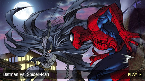
#1: Spider-Man’s Basic BlackÂ
Fans were shocked when Peter Parker’s iconic blue-and-red Spidey suit was replaced with a basic black number. They were even more surprised later to discover that the suit was actually a living alien symbiote, but that’s another story. While the original classic suit eventually returned, the black Symbiote suit remains a stunning design. By reducing everything to a basic black with only a few white spots for relief, artists were able to capture a moodiness and darkness in the character that was stark and tantalizing. And though the black made accentuating the physique more challenging, it also took the character design in a new direction, breathing new life into old Spidey.Â

Be sure to check out the video below to see our picks for the Top 10 Alternate Reality Versions of Batman.


